Platforms learning has become Decentralized, with no need for students to converge at one place physically to learn.
Platforms learning has become Decentralized, with no need for students to converge at one place physically to learn.
The same thing applies to learning online skills, because these skills are predominantly online, students primarily seek out learning resources online first, before exploring other options.
The same thing applies to learning online skills, because these skills are predominantly online, students primarily seek out learning resources online first, before exploring other options.
Duration
Duration
6 weeks (2022)
6 weeks (2022)
DELIVERABLES
DELIVERABLES
UI Screens, Design system
Product document, UX Artifacts
UI Screens, Design system
Product document, UX Artifacts
UI Screens, design system, product document, UX Artifacts
Scope
Scope
Documentation, Research
Strategy, Prototype & testing
Documentation, Research
Strategy, Prototype & testing
Documentation, Research, Strategy,
Prototype & testing
Role
Role
UI/UX designer
UI/UX designer
System Overview
System Overview
System Overview
Students will be able to register and take courses and after assessment receive certificates.
Tutors will be able to upload new content such as videos, assignments, and resources. They will also review and mark student assessments, all this will be done through a dedicated dashboard for tutors.
Admin is responsible for adding and removing courses and setting
Crafting a mesmerizing experience where design meets
Crafting a mesmerizing experience where design meets
Combining sophisticated design with effortless
flawless functionality
flawless functionality
flawless functionality
Insight gathered from the research can be found below
Insight gathered from the research can be found below
Insight gathered from the research can be found below
As part of the research efforts and to understand what exactly we wanted to build, I created a product requirement document to document the minimum viable product scope, user stories and characteristics, and more.
As part of the research efforts and to understand what exactly we wanted to build, I created a product requirement document to document the minimum viable product scope, user stories and characteristics, and more.
As part of the research efforts and to understand what exactly we wanted to build, I created a product requirement document to document the minimum viable product scope, user stories and characteristics, and more.
Research
Research
Research
My first goal was to bridge the knowledge gap about the problem we are solving, the business as well as the market. First I conducted usability heuristics to identify problems with existing solutions.
I also created a PRD document after some rounds of meeting with the stakeholders. This set the stage for proper user research. Before the research started together with the team we documented research objectives, goals, KPIs, and participant demographics.
First, I conducted a survey to know what people think about online learning and what platforms they’ve used. This gave me an idea of what people were familiar with and had built their mental model around.
Here are some research questions:
What challenges/Problems do you face using online learning platforms?
When last did you face this problem? (Context surrounding the problem, what time of the day did it happen? What kind of problem - for example; Had issues completing assessment? )
Interviewed 5 learners, 1 writer, 3 developers, and 1 designer
These were the 5 themes that came up, Accessibility, Motivation, Convenience, and Information.
Here are the solutions we came up with for each theme:
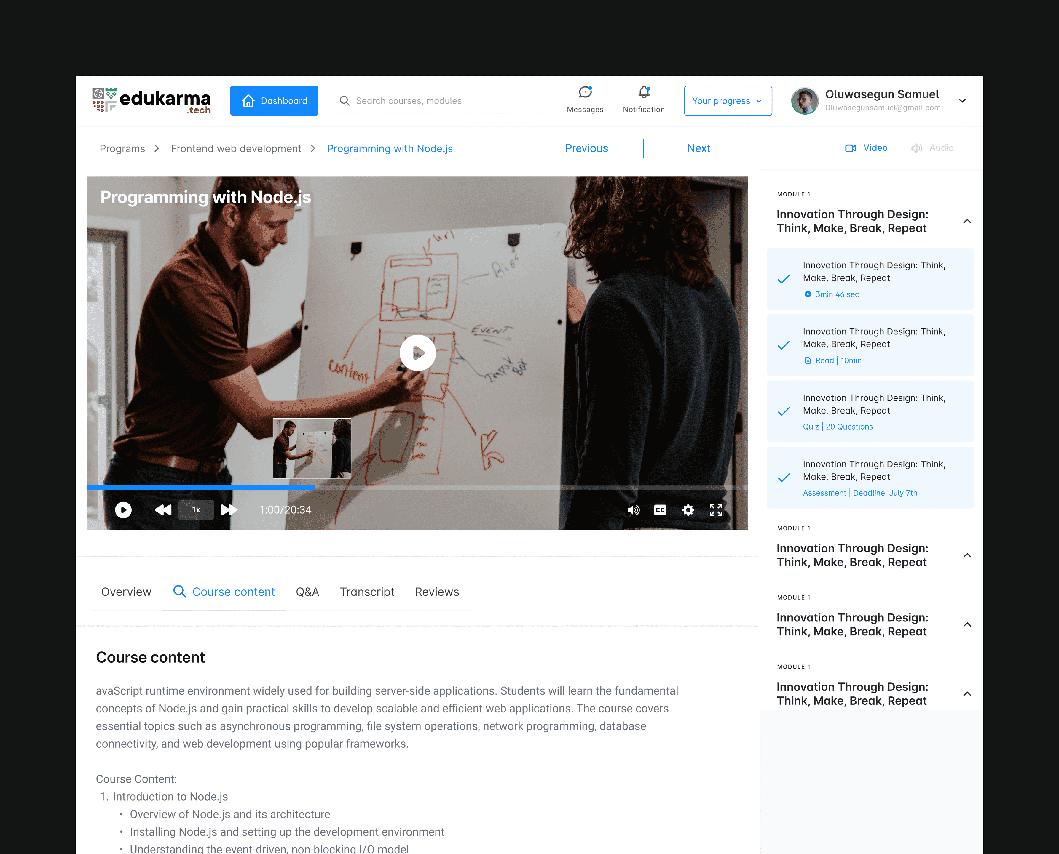
Accessibility: Users would be allowed to fast forward video content, turn on captions, and read video transcripts, learners would also be able to interact with instructors and fellow learners to simulate some semblance to an actual school.
Information: Instead of giving access to the entire program, students would have access to only the next module to ensure they don’t get overwhelmed with content and information. After each module, learners have to take a multi-choice assessment before proceeding to the next module.
Costs: To reduce data costs, we introduced an audio format that allows students to switch to audio to save data.
Convenience: Programmes are self-paced, which means you don’t have to start and finish at the same time as others, but to encourage participation, I introduced a leaderboard to show to learners and inspire students to learn fast and finish the program with their pairs.
5. Motivation: To ensure students are always excited to learn, beyond the leaderboard, learning comes in 3 formats, Readings (Text), Tutorials (Videos), and Audio.
To ensure consistency across the product suite, I created a comprehensive design system with components and styles.
The design system was built using easy-to-understand naming conventions and published into Figma styles and component libraries.
The design phase was divided into the following:
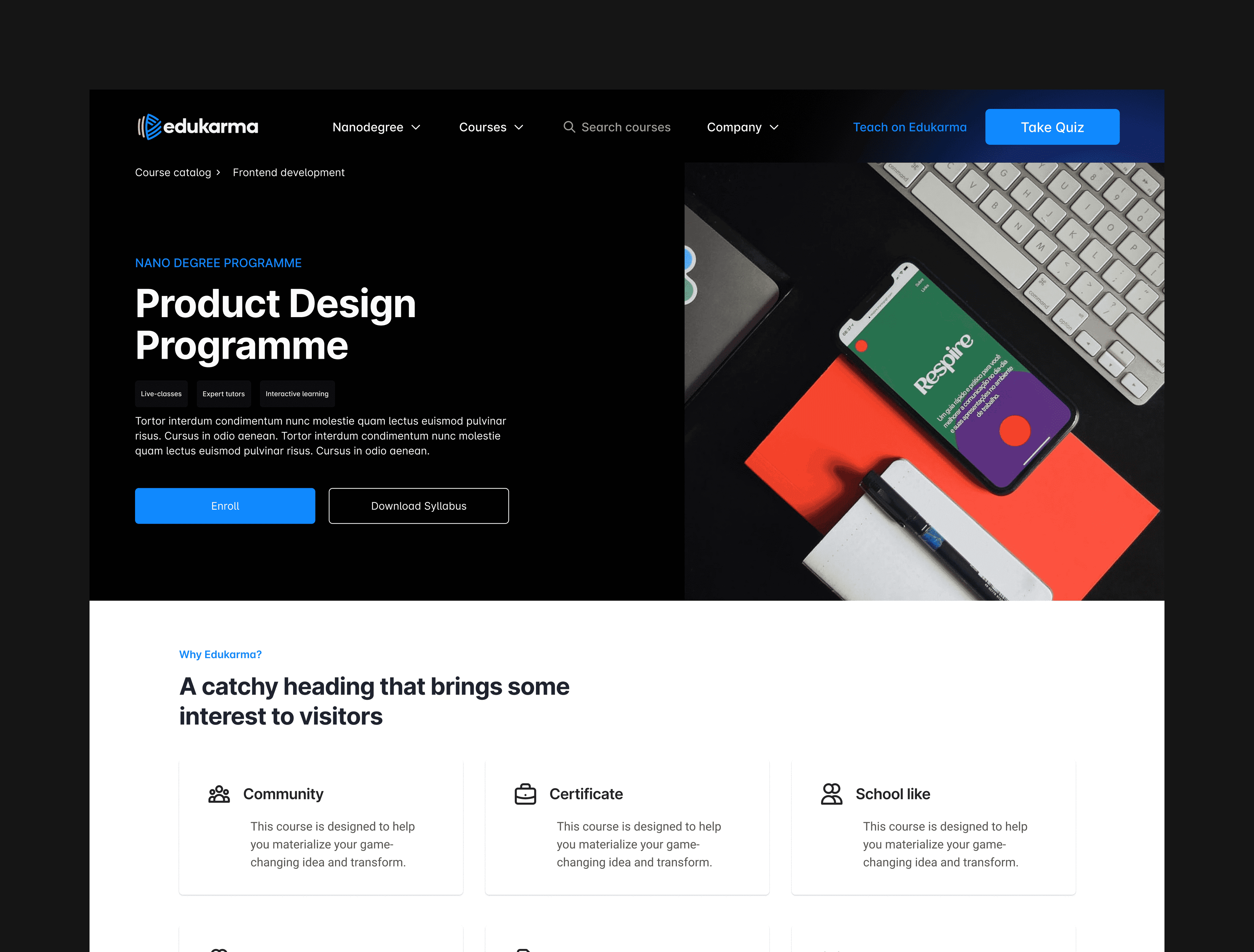
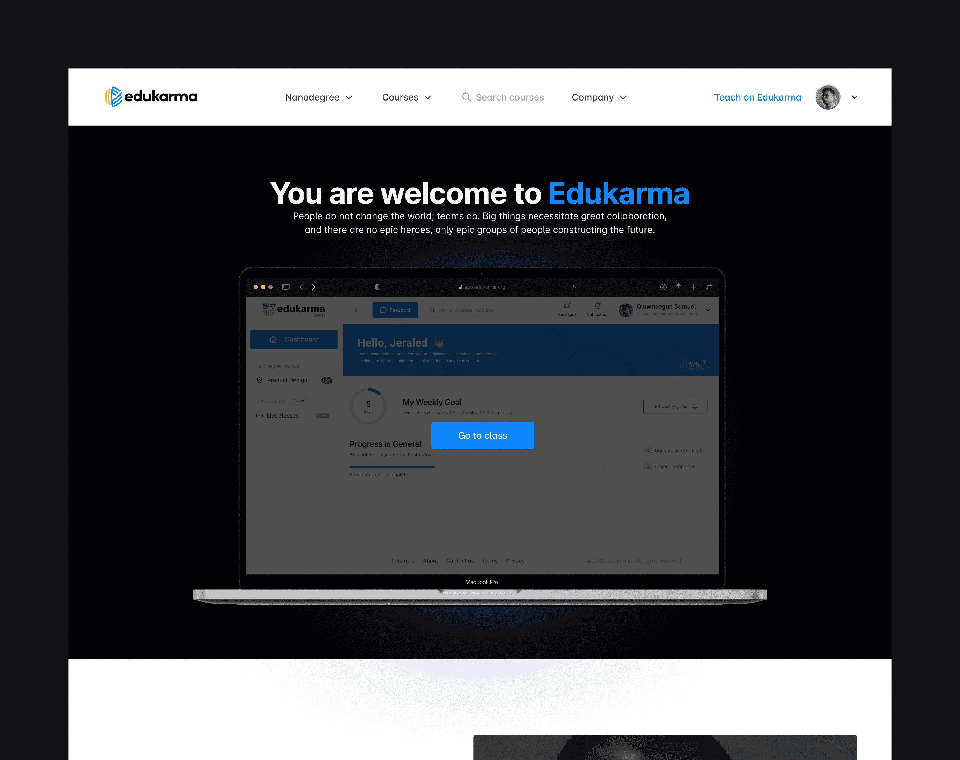
Website
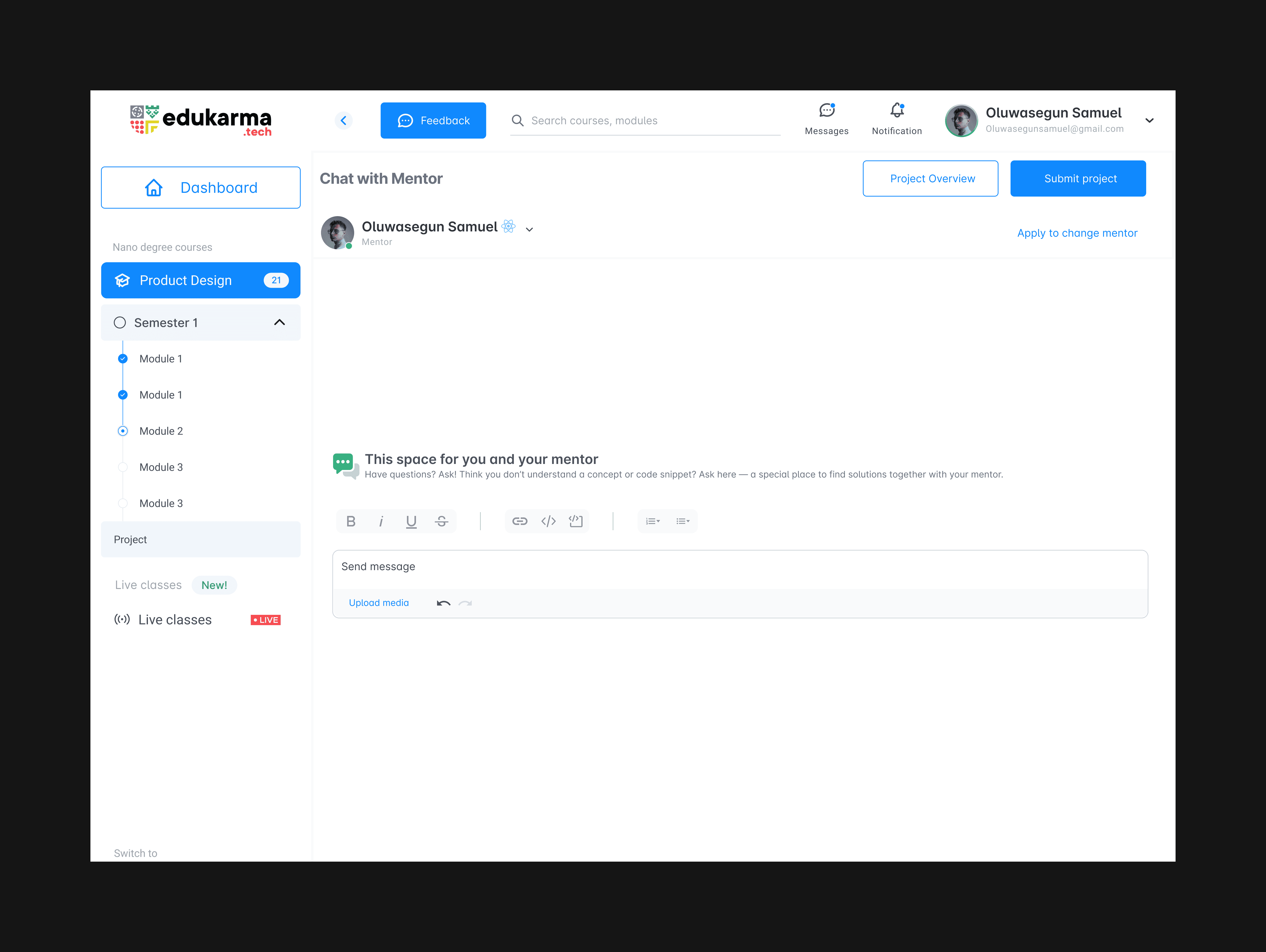
Student dashboard
Instructors dashboard
Moderators dashboard
Finance dashboard
Content dashboard
Super admin dashboard
While the design was ongoing I worked directly with a UX writer to ensure microcopies are easy to understand.
The engineering team was part of the design decision to ensure technical limitations were identified and addressed. The product was handed over the phases from the website to the dashboards. (Currently under development).
To ensure it is easy for other designers and developers to interact with the design, I created design documentation to capture specific interactions and how they should be built also design system documentation to make it easy for other designers and stakeholders to interact with what I have built.
Optimize for design speed: I discovered I spent a lot of time looping through different design ideas, and testing flows after flows. A better approach would have been to push out first iteration and test all flows at once and take feedback for changes.
These were the 5 themes that came up, Accessibility, Motivation, Convenience, and Information.
Here are the solutions we came up with for each theme:
Accessibility: Users would be allowed to fast forward video content, turn on captions, and read video transcripts, learners would also be able to interact with instructors and fellow learners to simulate some semblance to an actual school.
Information: Instead of giving access to the entire program, students would have access to only the next module to ensure they don’t get overwhelmed with content and information. After each module, learners have to take a multi-choice assessment before proceeding to the next module.
Costs: To reduce data costs, we introduced an audio format that allows students to switch to audio to save data.
Convenience: Programmes are self-paced, which means you don’t have to start and finish at the same time as others, but to encourage participation, I introduced a leaderboard to show to learners and inspire students to learn fast and finish the program with their pairs.
5. Motivation: To ensure students are always excited to learn, beyond the leaderboard, learning comes in 3 formats, Readings (Text), Tutorials (Videos), and Audio.
To ensure consistency across the product suite, I created a comprehensive design system with components and styles.
The design system was built using easy-to-understand naming conventions and published into Figma styles and component libraries.
The design phase was divided into the following:
Website
Student dashboard
Instructors dashboard
Moderators dashboard
Finance dashboard
Content dashboard
Super admin dashboard
While the design was ongoing I worked directly with a UX writer to ensure microcopies are easy to understand.
The engineering team was part of the design decision to ensure technical limitations were identified and addressed. The product was handed over the phases from the website to the dashboards. (Currently under development).
To ensure it is easy for other designers and developers to interact with the design, I created design documentation to capture specific interactions and how they should be built also design system documentation to make it easy for other designers and stakeholders to interact with what I have built.
Optimize for design speed: I discovered I spent a lot of time looping through different design ideas, and testing flows after flows. A better approach would have been to push out first iteration and test all flows at once and take feedback for changes.
User Flow
User Flow
User Flow
Information Architechture
Information Architechture
Information Architechture
The project aimed to create Relvet, a property listing platform that provides Nigerian buyers and tenants with an exceptional experience in their search for homes.
Through extensive user research and a meticulous design process, Relvet addresses user pain points, such as difficulties in finding preferred properties, verifying authenticity, and avoiding scams.
Up Next
Up Next
Open Project